ATAWICH BRAND VISUAL GUILDELINE
Atawich / imagery
Imagery
Atawich imagery should feel rich, appetizing, warm, and immediate. The photography system is built around two core directions: clean product photography that heroizes the food, and lifestyle imagery that shows real enjoyment, social energy, and brand atmosphere.
Use product imagery to present the food clearly and confidently. Use lifestyle imagery to show context, emotion, and the experience around the food.
Product Photography
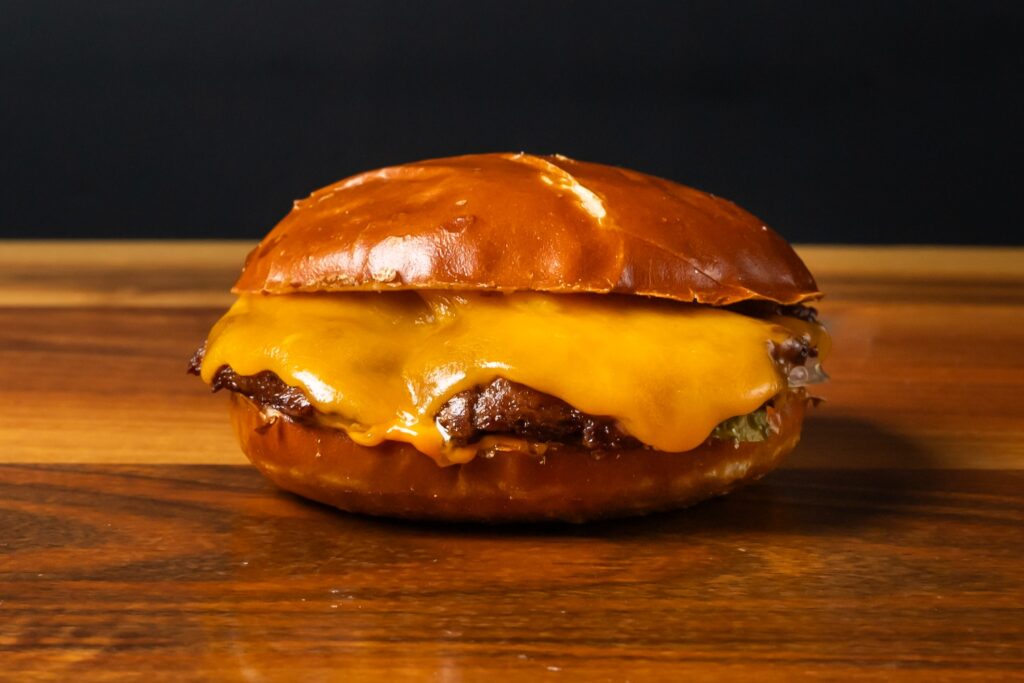
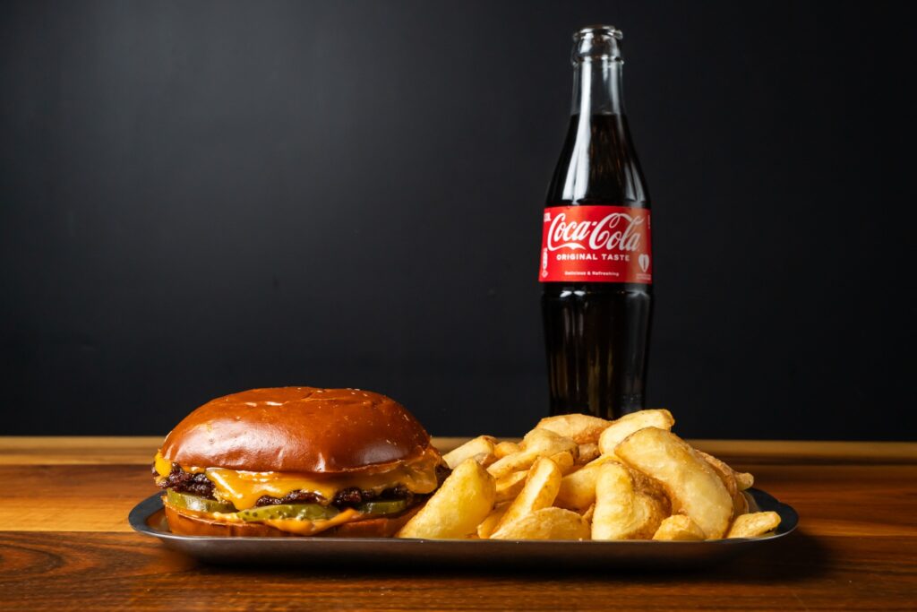
Product shots should be direct, controlled, and highly appetizing. Focus on texture, gloss, melted cheese, ingredient detail, and strong contrast. Backgrounds should be simple enough to keep full attention on the burger and plated set.
Correct Use / Hero Product Shot
Single-product hero image
A tight, centered composition with strong detail, warm lighting, and minimal distractions. Ideal for menu highlights, hero banners, and product pages.
Correct Use / Combo Presentation
Product set with supporting items
A tight, centered composition with strong detail, warm lighting, and minimal distractions. Ideal for menu highlights, hero banners, and product pages.
Lifestyle Photography
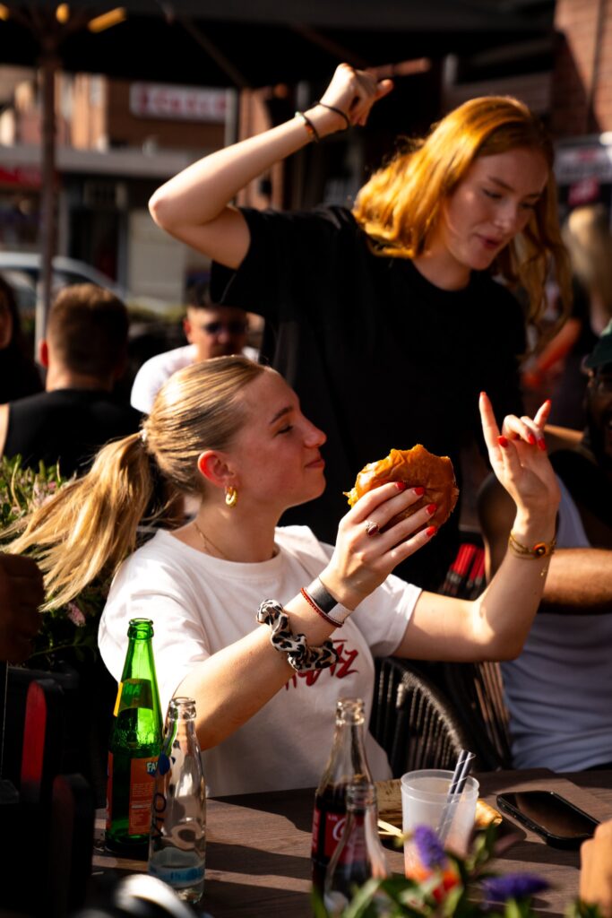
Lifestyle imagery should capture the social side of the brand: people eating, sharing, reacting, and enjoying the food in real environments. The tone should feel natural, lively, youthful, and warm — never overly staged or detached from the product
Correct Use / Social Experience
People + food + atmosphere
Show the burger as part of an energetic social moment. Real gestures, natural movement, and visible food make the image more useful for campaigns and social storytelling.
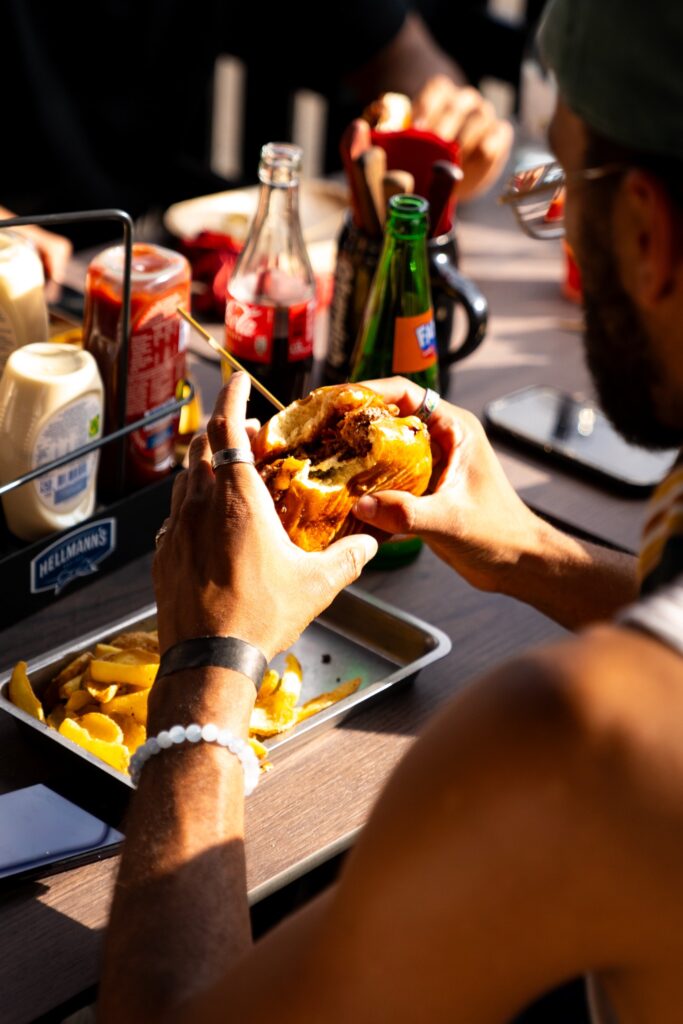
Correct Use / Close Experience
Hands-on brand experience
Closer lifestyle framing works well when the food remains the main subject but the context still feels human, casual, and real.
Imagery Don’ts
Below are common visual mistakes that weaken appetite appeal, brand consistency, and product clarity. These examples are intentionally wrong and show what should be avoided in Atawich brand communication.
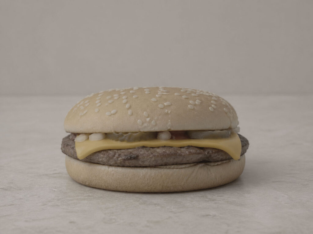
Too cold and flat
Do not use bland, lifeless product photography with weak appetite appeal, dull color, and no visual richness.
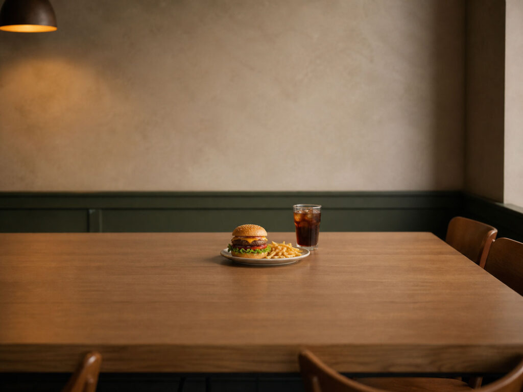
Product too small in frame
Do not place the meal too far away or let empty space dominate when the main goal is to sell the food.
Too much visual clutter
Do not overload the frame with too many props, distractions, and chaotic details that compete with the burger.
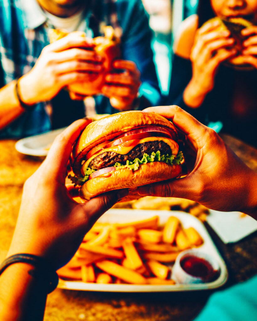
Over-processed and unnatural
Do not place the meal too far away or let empty space dominate when the main goal is to seDo not use extreme color grading, oversaturation, or artificial-looking edits that damage authenticity and readability.
ll the food.