ATAWICH BRAND VISUAL GUILDELINE
Atawich / Typography
Typography
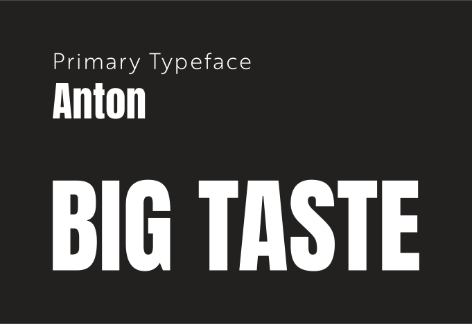
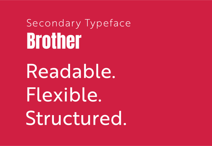
Atawich typography is built to feel bold, direct, and high-impact. The system uses Anton as the primary display typeface for headlines and brand moments, paired with Brother as the supporting type family for interface, subheads, descriptions, and structured communication.
This combination creates a tone that feels confident, urban, clear, and highly recognizable — ideal for a fast-food brand known for strong product messaging and immediate visual presence.
Typeface Overview
The typography system has one strong display voice and one flexible secondary family. Anton leads with impact. Brother handles readability, hierarchy, and operational clarity.
Rule
Use Anton for hero headlines, campaign lines, section titles, and strong display moments. Anton has a single weight, so hierarchy is created through size, spacing, scale, case, and layout — not weight variation.
Rule
Use Brother for subheadings, body copy, menus, UI labels, captions, pricing, and supporting information. It provides the flexibility needed for a scalable brand system across web, print, packaging, and digital campaigns.
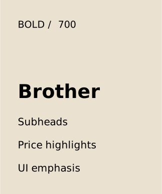
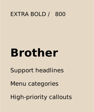
Brother Weights
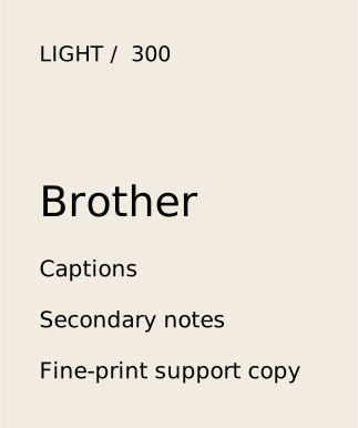
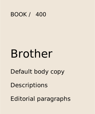
Brother is used in four weights to create structure and clarity throughout the system.
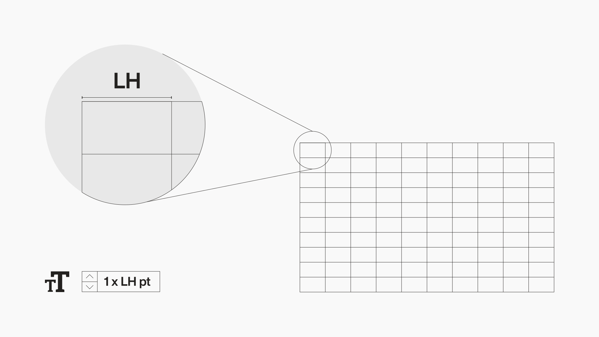
Type System
The type system should be simple, scalable, and repeatable across digital and print environments.
Typography Crimes
Keep the system clean. Avoid visual misuse that weakens recognition and consistency.
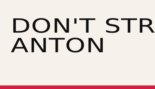
Do not
distort proportions, Never stretch, compress, or artificially skew either typeface.
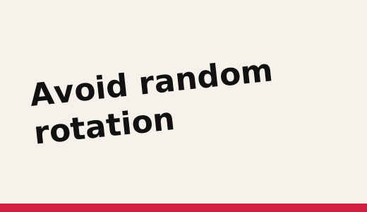
Do not
otate type without a system ,Typography should feel intentional, not decorative or unstable.
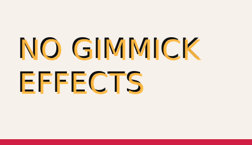
Do not
shadows or fake styling, Avoid outlines, bevels, shadows, and effects that dilute the brand voice
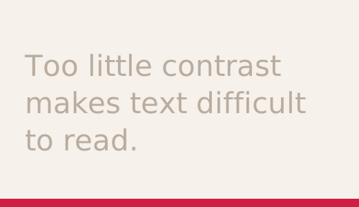
Do not
reduce legibility, Avoid low-contrast color pairings, especially in body copy and UI content.
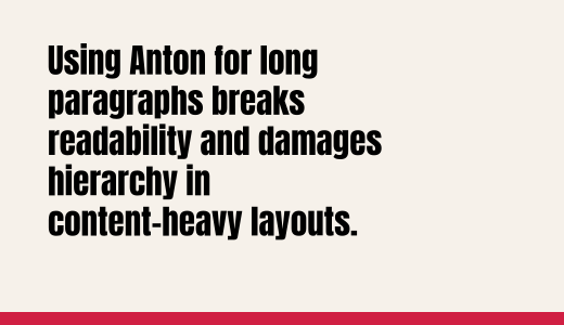
Do not
Anton for body text, Anton should remain a display tool only.
Do not
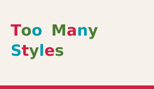
overload styling ,mix too many sizes, colors, and weights inside one message block.